Histogram Worksheet
Related Topics:
More Grade 6 Math Lessons
Free Math Worksheets
Free Printable Worksheets
Printable “Statistics” Worksheets:
Statistical Questions
Categorical vs. Numerical Data
Create Dot Plots
Interpret Dot Plots
Histograms
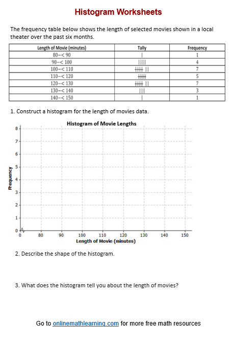
Free printable and online worksheets to help Grade 6 students review how to construct and interpret a frequency histogram.
Histogram
Histograms provide a visual representation of the distribution of a dataset. A histogram is useful to describe the shape of the data distribution. It is important to think about the shape of a data distribution because depending on the shape, there are different ways to describe important features of the distribution, such as center, variability, skewness, modality, and the presence of outliers. A histogram may have a symmetric or approximately symmetric distribution or it may have a skewed distribution.
Steps to Create a Histogram
- Gather the numerical data you want to visualize.
- Decide how many intervals (bins) you want to divide your data into. This can be determined based on the range of the data and the level of detail desired. Usually about 5 to 10 bins would be suitable.
- Calculate the bin width by subtracting the minimum value from the maximum value and then dividing by the number of bins.
- Create the frequency distribution by counting how many data points fall into each bin.
- Draw the Histogram:
On the horizontal axis, place the bins (intervals).
On the vertical axis, place the frequencies (counts) of data points in each bin.
Draw bars for each bin with heights corresponding to their frequencies.
Interpreting Histograms Distributions
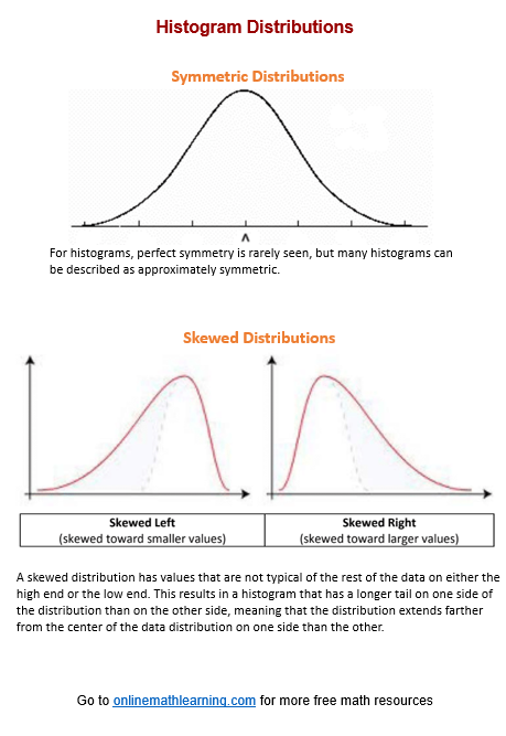
Shape of Distribution:
Symmetrical: The left and right sides are approximately mirror images.
Skewed Left (Negative Skew): The left tail is longer; most data points are on the right.
Skewed Right (Positive Skew): The right tail is longer; most data points are on the left.
Modality:
Unimodal: One peak.
Bimodal: Two peaks.
Multimodal: More than two peaks.
Spread and Range:
Indicates the variability of the data.
Wide spread suggests high variability; narrow spread suggests low variability.
Outliers:
Data points that fall far outside the range of most other points.
Can be identified as isolated bars at either end of the histogram.
Have a look at this video if you need to review how to create and interpret a histogram.
Click on the following worksheet to get a printable pdf document.
Scroll down the page for more Histogram Worksheets.
More Histogram Worksheets
Printable
(Answers on the second page.)
Histogram Worksheet #1
Histogram Worksheet #2
Histogram Worksheet #3
Histogram Worksheet #4
Related Lessons & Worksheets
| Check out our most popular games! | ||
|---|---|---|
 Fraction Concoction |
 Fact Family Game |
 Number Bond Garden |
 Online Addition Subtraction Game |
 Penguin Solitaire |
 Sawayama Solitaire |
 Ark Solitaire |
 Eldritch Invasion |
 Shenzhen Solitaire |
Check out more Solitaire games here.
We welcome your feedback, comments and questions about this site or page. Please submit your feedback or enquiries via our Feedback page.