Interpret Dot Plots Worksheet
Related Topics:
More Grade 6 Math Lessons
Free Math Worksheets
Free Printable Worksheets
Printable “Statistics” Worksheets:
Statistical Questions
Categorical vs. Numerical Data
Create Dot Plots
Interpret Dot Plots
Free printable and online worksheets to help Grade 6 students review how to describe the distribution of the points on the dot plot in terms of center and variability. Interpret dot plots, identify the range, mode and outliers.
Interpret Dot Plots
A dot plot is a visual representation of data distribution that uses dots to represent individual data points along a horizontal or vertical axis. It’s particularly useful for displaying the frequency of data values in small to moderate-sized datasets. Here’s how dot plots represent data distribution:
Steps to Create a Dot Plot
- Collect Data: Gather the numerical data you want to visualize.
- Draw a Number Line: Draw a horizontal line and mark it with evenly spaced intervals that cover the range of your data.
- Plot the Data Points: For each data point in your dataset, place a dot above the corresponding value on the number line. If multiple data points have the same value, stack the dots vertically.
Understanding Distribution Features:
By looking at a dot plot, you can gain insights into various aspects of your data distribution:
Frequency: The height of the stacked dots indicates the frequency of each value.
Spread: The range of the data can be seen from the smallest to the largest values. A wider spread of dots suggests higher variability, while dots clustered closely together indicate less variability.
Skewness: If the dots lean more towards one side of the plot (left or right), it suggests the data might be skewed in that direction.
Clusters and Gaps: Clusters of dots indicate where data points are concentrated, while gaps indicate the absence of data points in certain ranges.
Outliers: Dots that appear isolated from the main cluster of dots might represent potential outliers in your data.
Center: The location of the most frequent values (dots) gives you a sense of the central tendency of the data (e.g., mean or median).
Advantages of Dot Plots:
Simplicity: Easy to understand and interpret.
Clarity: Effectively shows individual data points while also providing a visual sense of frequency.
Comparisons: Useful for comparing the distribution of two or more small datasets visually by placing them side-by-side.
Limitations of Dot Plots:
Data Size: Not ideal for very large datasets as the numerous dots can become overwhelming and obscure the overall distribution.
Limited Detail: Doesn’t provide as much detail as some other data visualization techniques like histograms.
Have a look at this video if you need to review how to interpret a dot plot.
Click on the following worksheet to get a printable pdf document.
Scroll down the page for more Interpret Dot Plots Worksheets.
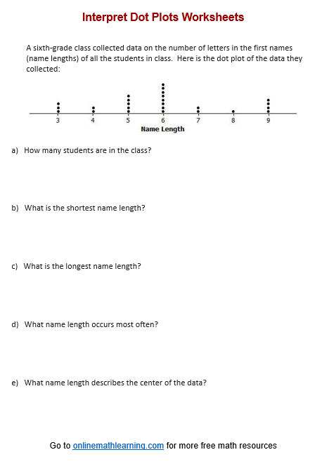
More Interpret Dot Plots Worksheets
Printable
(Answers on the second page.)
Interpret Dot Plots Worksheet #1
Interpret Dot Plots Worksheet #2
Interpret Dot Plots Worksheet #3
Related Lessons & Worksheets
| Check out our most popular games! | ||
|---|---|---|
 Fraction Concoction |
 Fact Family Game |
 Number Bond Garden |
 Online Addition Subtraction Game |
 Penguin Solitaire |
 Sawayama Solitaire |
 Ark Solitaire |
 Eldritch Invasion |
 Shenzhen Solitaire |
Check out more Solitaire games here.
We welcome your feedback, comments and questions about this site or page. Please submit your feedback or enquiries via our Feedback page.