Histograms
Related Pages
Frequency Tables
Mean And Mode From The Frequency Table
Median From The Frequency Table
Grade 6
More Statistics Lessons
These lessons help Grade 6 students learn
- how to define a histograms,
- how to make and interpret histograms,
- the differences between histograms and bar graphs.
Histogram vs Bar Chart
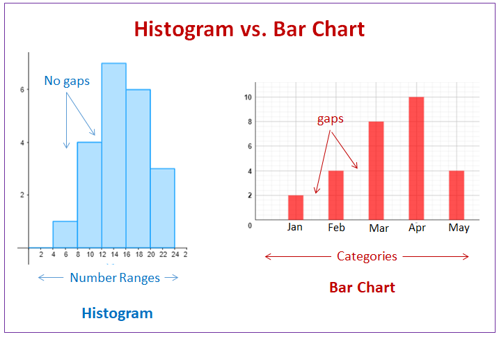
A histogram is a graphical tool used in statistics to visualize the distribution of quantitative (numerical) data. It’s similar in appearance to a bar chart, but with crucial distinctions.
Bar Chart: Displays categorical or discrete data. Bars are typically separated by gaps.
Histogram: Displays the distribution of continuous numerical data. Bars are typically adjacent. If the bars have non-uniform widths then the heights would represent the frequency density instead of the frequency. Check out the lesson on Histogram with non-uniform widths.
The following diagram shows the differences between a histogram and a bar chart. Scroll down the page for more examples and solutions on using histograms and comparing histograms with bar charts.

Statistics Worksheets
Practice your skills with the following worksheets:
Printable & Online Statistics Worksheets
Introduction to Histograms
How to define a histogram, interpret a histogram and create a histogram from data?
A histogram is a bar graph that represents a frequency distribution. The width represents the interval and the height represents the corresponding frequency. There are no spaces between the bars.
Example:
Create a histogram for the following data
Average gas mileage in miles/gallon:
24,17,14,22,25,26,38,42,24,12,28,19,32,21,35,28,21,31,18,19
Histograms, tally and frequency tables
Example:
Make a frequency table and histogram of the following data:
3,5,8,11,13,2,19,23,22,25,3,10,21,14,9,12,17,22,23,14
How to make a frequency histogram?
Example:
Draw a relative frequency histogram from the given data.
34,40,52,57,57,60,60,63,67,69,69,69,71,89
Compare Bar Graphs and Histograms
Histograms are used to show distributions of variables whereas bar charts are used to compare variables. Histograms plot quantitative data with ranges of the data grouped into intervals while bar charts plot categorical data.
Note that there are no spaces between the bars of a histogram since there are no gaps between the intervals. On the other hand, there are spaces between the variables of a bar chart.
Bar graphs and Histograms
Compare bar graphs and histogram
Examples:
1 a) Describe the data in the table.
b) Make a bar graph of the data.
c) What do the horizontal and vertical axes represent?
d) Which country won the most titles? the least titles?
2 a) Describe the data in the table.
b) What does each interval represent?
c) Make a histogram of the data
d) Describe general patterns in the histogram.
What Distinguishes a Histogram From a Bar Chart?
Histograms and bar graphs are used in the mathematics world for tracking pieces of information. Learn about histograms versus bar graphs.
Make and Interpret Histograms
Learn to make and interpret histograms
Example:
- Use the given data to make a histogram.
- Use the histogram and answer the following questions:
a) Are there more people who score 41-60 points or who scored 61-80 points?
b) What is the total number of people who took part in the game show?
Example:
Given a bar graph and a histogram
a) Explain which graph you would use to determine how many textbooks have less than 600 pages?
b) Explain which graph you would use to compare the size of a science book and history book?
Check out our most popular games!
Fraction Concoction Game:
Master fractions in the lab: mix, add, and subtract beakers to create the perfect concoction!
Fact Family Game:
Complete fact families and master the link between addition & subtraction and multiplication & division.
Number Bond Garden:
Clear the board by matching number pairs that sum to ten in this garden-themed mental math puzzle.
Online Addition Subtraction Game:
Practice your addition and subtraction skills to help the penguin find its mummy.
We welcome your feedback, comments and questions about this site or page. Please submit your feedback or enquiries via our Feedback page.


