Histogram (Non-Uniform Widths)
Related Pages
Histograms
Histograms - Illustrative Math
Frequency Tables
More Statistics Lessons
These lessons cover histograms with non-uniform class widths, how to draw and interpret such histograms.
What is a Histogram?
A histogram is a graphical representation of the distribution of numerical data. It uses bars to show how often data falls within specific ranges (called “bins” or “class intervals”). Unlike a bar chart (which compares categories), a histogram displays continuous data in intervals, with no gaps between bars unless a bin has zero frequency.
Key Features of a Histogram
X-axis (Horizontal): Represents the bins or class intervals.
Y-axis (Vertical): Represents the frequency or frequency density.
Bars: Touch each other (no gaps) to show continuity.
Standard Histogram (Uniform Width)
In a standard histogram, the data is divided into equal-width bins or class intervals.
The height of each bar represents the frequency (or relative frequency) of data points falling into that bin.
Non-Uniform Width Histogram
When you have a non-uniform width histogram:
The width of each bar on the x-axis can be different. Some intervals might be narrow, while others are wide.
The height of the bar does not directly represent the frequency. Instead, the height represents the frequency density.
\(\text{Frequency Density} = \frac{\text{Frequency}}{\text{Class Width}}\)
Area Represents Frequency:
The area of each bar is proportional to the frequency (or relative frequency) of observations in that class interval. This is the fundamental principle that ensures the histogram accurately represents the distribution, even with unequal widths.
How to interpret and draw a histogram?
When constructing a histogram with non-uniform (unequal) class widths, we must ensure that the
areas of the bars are proportional to the class frequencies.
Remember that the histogram differs from a bar chart in that it is the area of the bar that denotes the value, not the height. This means that we would need to consider the class widths in order to determine the height of each bar.
Example:
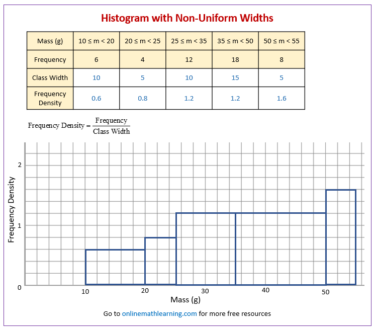
The following frequency distribution gives the masses of 48 objects measured to the nearest gram.
Draw a histogram to illustrate the data.
| Mass (g) | 10 ≤ m < 20 | 20 ≤ m < 25 | 25 ≤ m < 35 | 35 ≤ m < 50 | 50 ≤ m < 55 |
|---|---|---|---|---|---|
| Frequency | 6 | 4 | 12 | 18 | 8 |
Solution:
-
Add two more rows to the above grouped frequency table:
a) Class Width: The difference between the upper class boundary and the lower class boundary for each interval.
b) Frequency Density: Calculate this for each class interval using the formula:
\(\text{Frequency Density} = \frac{\text{Frequency}}{\text{Class Width}}\) -
Draw the Axes:
X-axis: Label this axis with the variable your data represents. Mark a continuous scale that covers the entire range of your data, including all class boundaries. Make sure it’s drawn to scale.
Y-axis: Label this axis as “Frequency Density”. Choose an appropriate scale that accommodates the highest frequency density value you calculated. Make sure the axis starts at 0. -
Draw the Bars:
For each class interval, draw a rectangle (bar) according to these rules:
a) Base (Width): The base of the rectangle extends along the x-axis from the lower class boundary to the upper class boundary of that interval.
b) Height: The height of the rectangle corresponds to the frequency density you calculated for that interval.
c) The bars should touch each other (unless there’s an interval with zero frequency, in which case there would be a gap).

:
Statistics Worksheets
Practice your skills with the following worksheets:
Printable & Online Statistics Worksheets
Histogram with uneven class widths
Higher GCSE topic revision
Understand what is a histogram.
Draw a histogram given some information.
Interpret a histogram.
GCSE Maths - Histograms - Unequal Class Intervals - Frequency Density - Higher A/A* grade
Example 1: The table below shows the length in mm of some
worms found in Steve’s garden. Draw a histogram to represent the information.
Example 2: The histogram shows the range of ages of members of a sports centre. Complete the frequency table.
Example 3: The histogram gives information about the heights of 540 Christmas trees. Work out an estimate for the number of Christmas trees with a height greater than 3 metres.
How to find the width and height of a class interval?
Example: The lifetime of a bulb in hours is given in the table.
If the width of the 95-105 class is 2cm and the height is 9cm. Find the width and height of the 105-130 class.
Histogram (unequal class intervals)
Example: The police wants to know how many cars exceed the speed
limit. An officer stands with a speed gun and records the speeds of 1000 consecutive cars.
(a) Identify one possible source of bias for this experiment.
(b) The grouped frequency table represents the speeds of the 1000 cars. On the grid, show the data on a histogram.
(c) The speed limit for the road is 30 miles per hour. Two cars are chosen at random from the 1000 cars. Estimate the probability that both cars are at least 10% above the speed limit.
Check out our most popular games!
Fraction Concoction Game:
Master fractions in the lab: mix, add, and subtract beakers to create the perfect concoction!
Fact Family Game:
Complete fact families and master the link between addition & subtraction and multiplication & division.
Number Bond Garden:
Clear the board by matching number pairs that sum to ten in this garden-themed mental math puzzle.
Online Addition Subtraction Game:
Practice your addition and subtraction skills to help the penguin find its mummy.
We welcome your feedback, comments and questions about this site or page. Please submit your feedback or enquiries via our Feedback page.


