Histogram (Uniform Widths)
Related Pages
Histograms vs Bar Graphs
In these lessons, we will learn to create histograms of equal widths from data and also to interpret histograms.
What is a Histogram?
A histogram is a vertical bar chart in which the frequency corresponding to a class is represented by the area of a bar (or rectangle) whose base is the class width.
Note that the histogram differs from a bar chart in that it is the area of the bar that denotes the value, not the height. However, if the widths of the bars are uniform then only the height need to be considered.
In this lesson, we will look at histograms with uniform (equal) widths. In another lesson, we will look at histograms with non-uniform widths
In a histogram:
There are no gaps between the rectangles.
The y-axis is the frequency and always starts at 0.
Example:
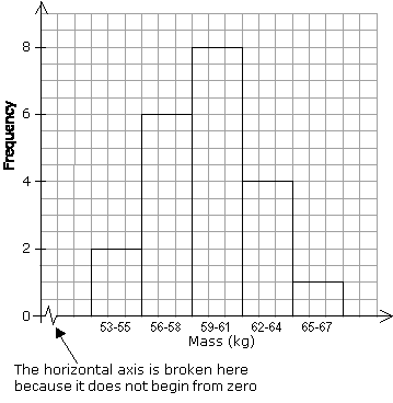
The following table shows the frequency distribution of the masses, in kg, of 21 members of a sports club.
Mass (kg) |
53 – 55 |
56 – 58 |
59 – 61 |
62 – 64 |
65 – 67 |
Frequency |
2 |
6 |
8 |
4 |
1 |
A histogram of the above frequency table is as follows:
Statistics Worksheets
Practice your skills with the following worksheets:
Printable & Online Statistics Worksheets
An introduction to histograms and explains how to create a histogram from given data
Define a histogram.
Interpret a histogram.
Create a histogram from data.
A histogram is a bar graph that represents a frequency distribution. The width represents the interval and the height represents the corresponding frequency. There are no spaces between the bars.
Example:
Create a histogram from the following data:
Average Gas Mileage: 24,17,14,22,25,26,38,42,24,12,28,19,32,21,35,28,21,31,18,19
If there are no breaks in the data, then normally the last data value of a bin is the first value in the next bin.
Histogram Explained
This video will show you step by step on how to create a histogram from data.
Properties of Histograms
- Quantitative Data
- No gaps
- Bar Width (Bin size or Class size)
- Y-axis corresponds to the frequency
Example:
Here are the grades of 15 students
88,48,60,51,57,85,69,75,97,72,71,79,65,63,73
Build a histogram from the data.
When to Use a Histogram:
To visualize the distribution of a single continuous numeric variable.
To understand the shape, center, and spread of a dataset.
To identify potential outliers or unusual patterns.
To check if data approximates a certain distribution (e.g., normal distribution).
To compare the distribution of data from different time periods or conditions.
Key Difference from Bar Charts:
Often confused with bar charts, the fundamental difference is the type of data they represent:
Histogram: Displays the distribution of continuous numerical data. Bars are typically adjacent.
Bar Chart: Displays categorical or discrete data. Bars are typically separated by gaps.
Check out our most popular games!
Fraction Concoction Game:
Master fractions in the lab: mix, add, and subtract beakers to create the perfect concoction!

Fact Family Game:
Complete fact families and master the link between addition & subtraction and multiplication & division.

Number Bond Garden:
Clear the board by matching number pairs that sum to ten in this garden-themed mental math puzzle.

Online Addition Subtraction Game:
Practice your addition and subtraction skills to help the penguin find its mummy.

We welcome your feedback, comments and questions about this site or page. Please submit your feedback or enquiries via our Feedback page.