Math Statistics: Line Graphs
In these lessons, we will learn
- how to create line graphs
- how to interpret line graphs
Related Pages
Interpret Line Graphs
Pie Charts
Bar Charts
More Statistics Lessons
What Is A Line Graph?
We may represent data using a line graph. A line graph is formed by joining the points given by the data with straight lines.
A line graph is usually used to show the change of information over a period of time. This means that the horizontal axis is usually a time scale, for example minutes, hours, days, months or years.
Example:
The table shows the daily earnings of a store for five days.
| Day | Mon | Tues | Wed | Thurs | Fri |
| Earnings | 300 | 450 | 200 | 400 | 650 |
a) Construct a line graph for the frequency table.
b) On which days were the earnings above $ 400
Solution:
a)

b) The earnings were above $ 400 on Tuesday and Friday.
Example:
The following line graph shows the total number of animals in a zoo.
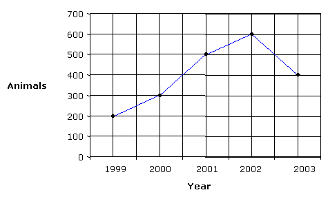
a) In which year did the zoo have the largest number of animals?
b) What is the percentage increase of animals in the zoo from 1999 to 2001?
Solution:
a) The zoo had the largest number of animals in 2002
b) The percentage increase of animals in the zoo from 1999 to 2001 is
![]()
Multiple sets of related data can also be represented by using multiple lines on a line graph.
Example:
The table shows the daily sales in RM of different categories of items for five days.
| Day | Mon | Tues | Wed | Thurs | Fri |
| Drinks | 300 | 450 | 150 | 400 | 650 |
| Food | 400 | 500 | 350 | 300 | 500 |
a) Construct a line graph for the frequency table.
b) On what days were the sales for drinks better than the sales for food?
c) What is the total earnings for food and drinks on Wednesday?
Solution:
a)
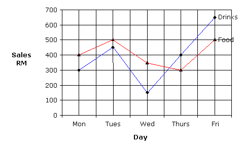
b) Sales for drinks were better than sales for food on Thursday and Friday
c) Total earnings for food and drinks on Wednesday is
150 + 350 = $ 500
How to create line graphs using given data, and answer questions based on given line graphs?
Learn how to interpret line graphs
Line Graphs
This video describes why we use line graphs and how to read and interpret them.
How to read and interpret line graphs?
Also contains an example of seeing a trend and extrapolating the data.
Try out our new and fun Fraction Concoction Game.
Add and subtract fractions to make exciting fraction concoctions following a recipe. There are four levels of difficulty: Easy, medium, hard and insane. Practice the basics of fraction addition and subtraction or challenge yourself with the insane level.

We welcome your feedback, comments and questions about this site or page. Please submit your feedback or enquiries via our Feedback page.