Circle Graphs / Pie Charts / Pie Graphs
In these lessons, we will learn:
- how to construct circle graphs or pie charts.
- how to read or use circle graphs or pie charts.
Related Pages
Graphical Methods For Describing Data
Bar Charts
Statistics Lessons
Constructing Circle Graphs Or Pie Charts
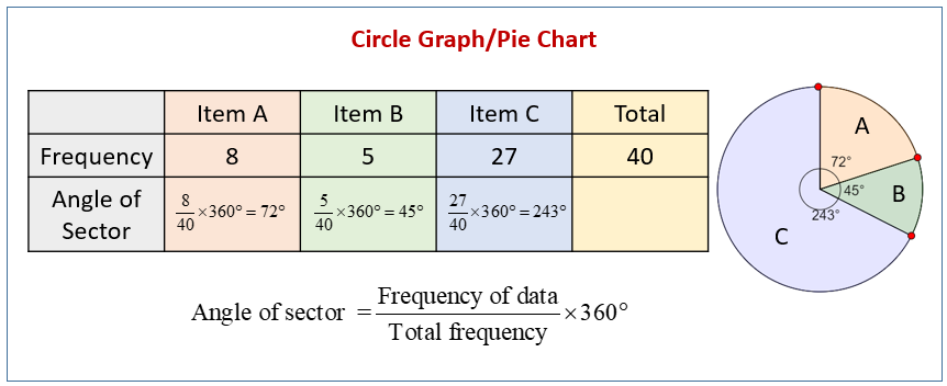
A pie chart (also called a Pie Graph or Circle Graph) makes use of sectors in a circle. The angle of a sector is proportional to the frequency of the data.
The following diagram shows how to use the formula to determine the angle of each sector in a circle graph or pie chart.

Study the following steps of constructing a circle graph or pie chart:
Step 1: Calculate the angle of each sector, using the formula.
Step 2: Draw a circle using a pair of compasses.
Step 3: Use a protractor to draw the angle for each sector.
Step 4: Label the circle graph and all its sectors.
Example:
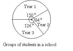
In a school, there are 750 students in Year1, 420 students in Year 2 and 630 students in Year 3.
Draw a circle graph to represent the numbers of students in these groups.
Solution:
Total number of students = 750 + 420 + 630 = 1,800.
Draw the circle, measure in each sector. Label each sector and the pie chart.

How To Construct A Circle Graph Or Pie Chart From A Table Of Percentages Or Fractions?
Steps to making a circle graph:
- Determine what percent of the data is from each category.
- Determine what percent of 360 degrees represents each category.
- Divide up the circle.
How To Make A Pie Graph Using A Protractor And Compass?
This video shows how to construct a circle graph from the given data.
How To Construct A Circle Graph Given The Percentage Of Each Sector?
How To Draw A Pie Chart?
This video shows how to draw a pie chart by working out angles from a table.
Example: The table shows 18 people’s favorite color. Display the information as a pie chart.
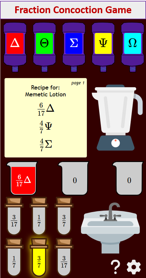
Try out our new and fun Fraction Concoction Game.
Add and subtract fractions to make exciting fraction concoctions following a recipe. There are four levels of difficulty: Easy, medium, hard and insane. Practice the basics of fraction addition and subtraction or challenge yourself with the insane level.

We welcome your feedback, comments and questions about this site or page. Please submit your feedback or enquiries via our Feedback page.