Median, Quartiles & Percentiles (Grouped Data)
Related Pages
Quartiles
Mean, Median, Mode, Range
More Statistics Lessons
In these lessons, we will learn how to obtain the median, quartiles and percentiles from the cumulative frequency graph of the distribution (grouped data). The cumulative frequency graph is also called an ogive.
Cumulative Frequency Graph
- Understand the Cumulative Frequency Graph
The x-axis represents the upper class boundaries of the grouped data.
The y-axis represents the cumulative frequency.
The graph is a curve that increases as you move from left to right. - Steps to Find the Median, Quartiles, and Percentiles
Step 1: Identify the Total Frequency (N)
The highest point on the cumulative frequency curve is the total frequency (N).
Step 2: Locate the Median, Quartiles, and Percentiles
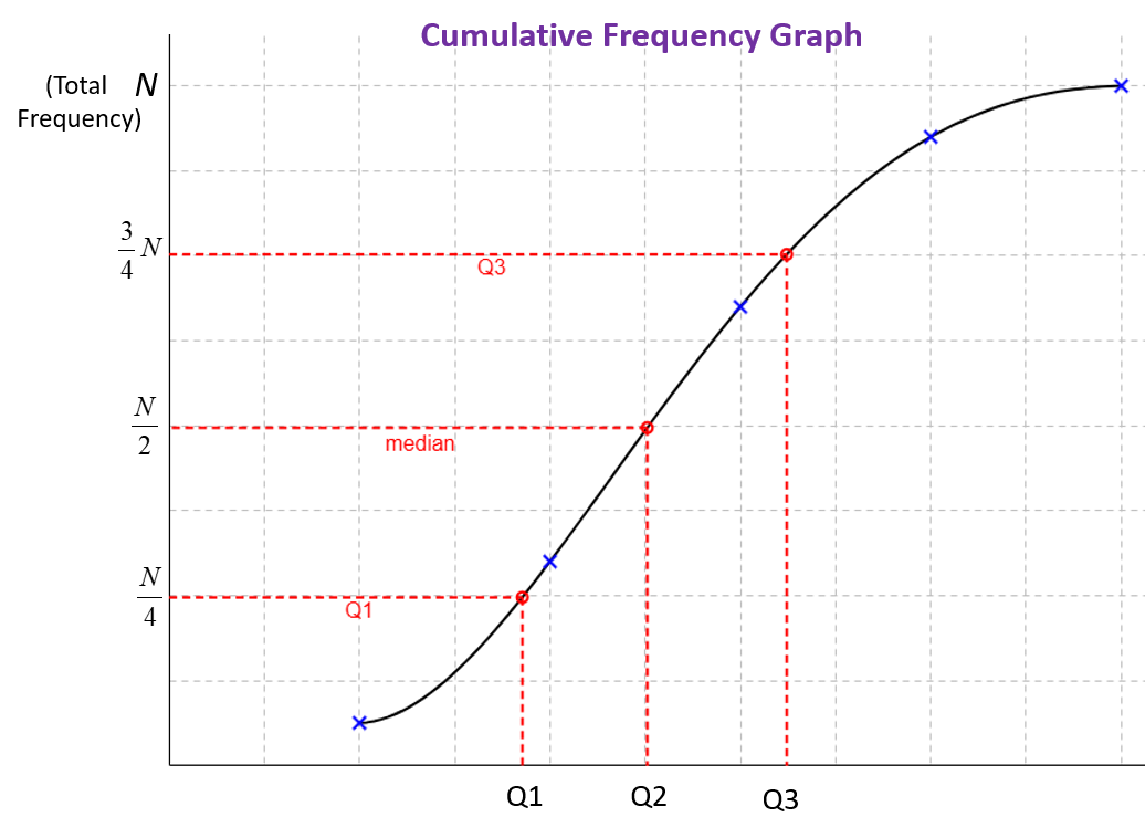
Median (Q2): Corresponds to N/2 on the y-axis.
First Quartile (Q1): Corresponds to N/4 on the y-axis.
Third Quartile (Q3): Corresponds to 3/4 N on the y-axis.
Percentile (P): Corresponds to P/100 × N (where P is the desired percentile).
Step 3: Draw Horizontal Lines
From the y-axis, draw a horizontal line at the required cumulative frequency value until it intersects the cumulative frequency curve.
Step 4: Draw Vertical Lines
From the point of intersection, draw a vertical line down to the x-axis.
The value on the x-axis is the median, quartile, or percentile.
The following diagram shows how to use a cumulative frequency graph to find Q1, Q2 and Q3.

Example:
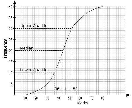
The following cumulative frequency graph shows the distribution of marks scored by a class of 40
students in a test.

Use the graph to estimate
a) the median mark
b) the upper quartile
c) the lower quartile
d) the interquartile range
Solution:
a) Median corresponds to the 50th percentile
i.e. 50% of the total frequency.
50% of the total frequency = ![]()
The median on the vertical axis = 40 ÷ 2 = 20
From the graph, 20 on the vertical axis corresponds to 44 on the horizontal axis. The median mark is 44.
b) The upper quartile corresponds to the 75th percentile i.e. 75% of the total frequency.
75% of the total frequency = ![]()
From the graph, 30 on the vertical axis corresponds to 52 on the horizontal axis. The upper quartile is 52.
c) The lower quartile corresponds to the 25th percentile i.e. 25% of the total frequency.
25% of the total frequency = ![]()
From the graph, 10 on the vertical axis corresponds to 36 on the horizontal axis. The lower quartile is 36.
d) The interquartile range = upper quartile – lower quartile
= 52 – 36 = 16
How cumulative frequency diagrams are used to estimate the median and quartiles of a frequency distribution?
Cumulative Frequency - Finding the Median and Interquartile Range for Grouped Data
Reading Cumulative Frequency Graphs
This video shows you how to interpret cumulative frequency graphs. It shows you how to find the median,
lower quartile, upper quartile and interquartile range, IQR.
Cumulative Frequency Curve
This video helps you to understand how to work out cumulative frequency, draw the cumulative frequency
graph and find the median, lower quartile, upper quartile and interquartile range.
Check out our most popular games!
Fraction Concoction Game:
Master fractions in the lab: mix, add, and subtract beakers to create the perfect concoction!
Fact Family Game:
Complete fact families and master the link between addition & subtraction and multiplication & division.
Number Bond Garden:
Clear the board by matching number pairs that sum to ten in this garden-themed mental math puzzle.
Online Addition Subtraction Game:
Practice your addition and subtraction skills to help the penguin find its mummy.
We welcome your feedback, comments and questions about this site or page. Please submit your feedback or enquiries via our Feedback page.


