Graphs and Numerical Summaries
Related Topics:
Lesson Plans and Worksheets for Grade 6
Lesson Plans and Worksheets for all Grades
More Lessons for Grade 6
Common Core For Grade 6
Videos and solutions to help grade 6 students learn how to match the graphical representations and numerical summaries of a distribution, Matches involve dot plots, histograms, and summary statistics.
New York State Common Core Math Grade 6, Module 6, Lesson 18
Download lessons for 6th Grade
Lesson 18 Student Outcomes
- Students match the graphical representations and numerical summaries of a distribution. Matches involve dot plots, histograms, and summary statistics.
Lesson 18 Summary
Generally, we can compute or approximate many values in a numerical summary for a data set by looking at a histogram or a dot plot for the data set. Thus, we can generally match a histogram or a dot plot to summary measures provided.
When making a histogram and a dot plot for the same data set, the two graphs will have similarities. However, some information may be more easily communicated by one graph as opposed to the other.
Lesson 18 Problem Set
- The following histogram shows the amount of coal produced (by state) for the 20 largest coal-producing states in 2011. Many of these states produced less than 50 million tons of coal, but one state produced over 400 million tons (Wyoming). For the histogram, which one of the three sets of summary measures could match the graph? For each choice that you eliminate, give at least one reason for eliminating the choice.
a. Minimum = 1, Q1 = 12, Median = 36, Q3 = 57, Maximum = 410; Mean = 33, MAD = 2.76
b. Minimum = 2, Q1 = 13.5, Median = 27.5, Q3 = 44, Maximum = 439; Mean = 54.6, MAD = 52.36
c. Minimum = 10, Q1 = 37.5, Median = 62, Q3 = 105, Maximum = 439; Mean = 54.6, MAD = 52.36 - The heights (rounded to the nearest inch) of the 41 members of the 2012–2013 University of Texas Men’s Swimming and Diving Team are shown in the dot plot below.
a. Use the dot plot to determine the 5-number summary (minimum, lower quartile, median, upper quartile, and maximum) for the data set.
b. Based on this dot plot, make a histogram of the heights using the following intervals: 66 to < 68 inches, 68 to < 70 inches, and so on. - Data on the weight (in pounds) of 143 wild bears are summarized in the histogram below. Which one of the three dot plots below could be a dot plot of the bear weight data? Explain how you determined which the correct plot is.
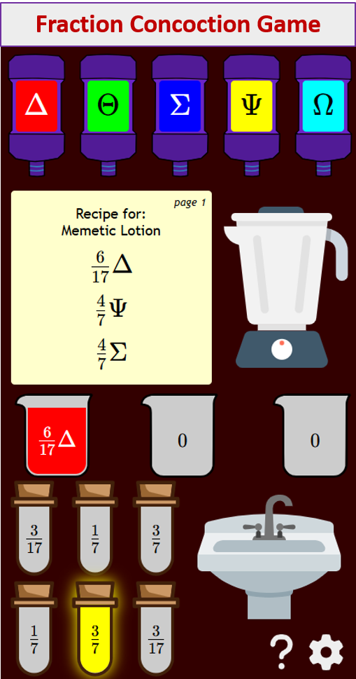
Try out our new and fun Fraction Concoction Game.
Add and subtract fractions to make exciting fraction concoctions following a recipe. There are four levels of difficulty: Easy, medium, hard and insane. Practice the basics of fraction addition and subtraction or challenge yourself with the insane level.

We welcome your feedback, comments and questions about this site or page. Please submit your feedback or enquiries via our Feedback page.