Statistics - Data Analysis
Resources for Grade 3 Math
Statistics Lessons
Videos, solutions, worksheets, games, and activities to help Grade 3 students learn statistics.
In these lessons, we shall learn how to use
- Tally Charts
- Line Plots
- Bar Charts / Bar Graphs
Tally Charts
Gathering data requires an organized system of collecting the information. Using tally marks is a simple way for you to keep track of information as you collect it. Tally marks are most effective when recorded in an organized column chart like the one below. Grouping the tally marks in 5s makes it easier for you to total the numbers in each category by skip counting. Remember to keep your bundles of 5 separate from each other. Tally charts should always be given a title to inform the reader about the meaning of the data.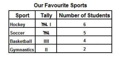
Using A Tally Chart
How to use a tally chart to record data from a simple survey?
How to make and interpret tally charts and frequency tables?
Line Plots
Another useful tool for organizing data is the line plot.
The line plot displays each piece of data by marking an ‘X’ (cross) above the corresponding choice/value
along a horizontal line, as shown in the following examples.
Example:
In the line plot below:
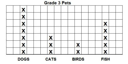
- What is the most common type of pet owned by students in Grade 3 ?
- What is the least common type of pet owned by students in Grade 3 ?
- How many more dogs are there than birds?
- How many students in all own pets?
Answer:
- Dogs
- Birds
- There are 5 more dogs.
- There are 17 students with pets.
Example:
Some students took a survey to see how many pencils each had in their desk. The recorded the fata in the line plot.
How many students have 6 pencils in their desk?
1. Which number of pencils was found the most?
2. Write a sentence to describe the data.
3. How many pencils are in your desk?
4. Put an x above the number of pencils in your desk.
What does the shape of the data show?
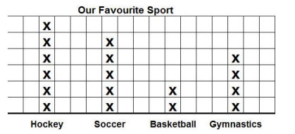
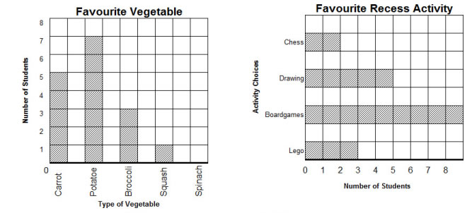
Bar Graphs
A bar graph is another useful tool for organizing data. Bar graphs can be vertical or horizontal. The height or length of the bars represents a number and each bar represents a separate category.
Which color did the most children like?
Which color did the least children like?
How many more children liked red than yellow?
How many children liked red, green and brown?
Reading Simple Bar Graphs
Statistics Worksheets
Statistics Games
Try the free Mathway calculator and
problem solver below to practice various math topics. Try the given examples, or type in your own
problem and check your answer with the step-by-step explanations.