Illustrative Mathematics Grade 6, Unit 8, Lesson 17: Using Box Plots
Learning Targets:
- I can use a box plot to answer questions about a data set.
- I can use medians and IQRs to compare groups.
Related Pages
Illustrative Math
Grade 6
Lesson 17: Using Box Plots
Let’s use box plots to make comparisons.
Illustrative Math Unit 6.8, Lesson 17 (printable worksheets)
Lesson 17 Summary
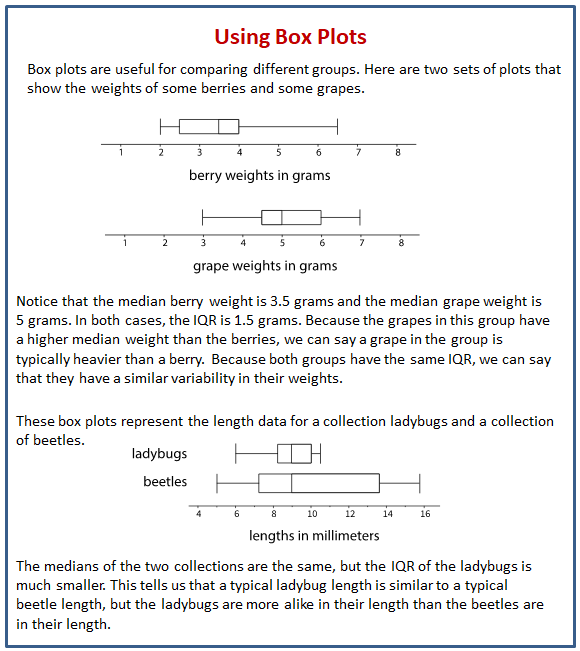
The following diagram shows how to use medians and IQRs to compare groups.

Lesson 17.1 Hours of Slumber
Ten sixth-grade students were asked how much sleep, in hours, they usually get on a school night. Here is the five-number summary of their responses.
Minimum: 5 hours
First quartile: 7 hours
Median: 7.5 hours
Third quartile: 8 hours
Maximum: 9 hours
On the grid, draw a box plot for this five-number summary.
What questions could be answered by looking at this box plot?
Lesson 17.2 Info Gap: Sea Turtles
Your teacher will give you either a Problem Card or a Data Card about sea turtles that nest on the Outer Banks of North Carolina. Do not show or read your card to your partner.
If your teacher gives you the problem card:
- Silently read your card, and think about what information you need to answer the question.
- Ask your partner for the specific information that you need.
- Explain to your partner how you are using the information to solve the problem.
- Solve the problem, and explain your reasoning to your partner.
If your teacher gives you the data card: - Silently read the information on your card.
- Ask your partner, “What specific information do you need?” Wait for your partner to ask for information. Only give information that is on your card. (Do not figure out anything for your partner!)
- Before telling your partner the information, ask, “Why do you need that information?”
- After your partner solves the problem, ask them to explain their reasoning. Listen to their explanation.
Pause here so your teacher can review your work. Ask your teacher for a new set of cards and repeat the activity, trading roles with your partner.
Lesson 17.3 Paper Planes
Andre, Lin, and Noah each designed and built a paper airplane. They launched each plane several times and recorded the distance of each flight in yards.
Work with your group to summarize the data sets with numbers and box plots.
- Write the five-number summary for the data for each airplane. Then, calculate the interquartile range for each data set.
- Draw three box plots, one for each paper airplane. Label the box plots clearly.
- How are the results for Andre’s and Lin’s planes the same? How are they different?
- How are the results for Lin’s and Noah’s planes the same? How are they different?
Are you ready for more?
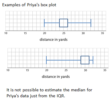
Priya joined in the paper-plane experiments. She launched her plane eleven times and recorded the lengths of each flight. She found that her maximum and minimum were equal to Lin’s. Her IQR was equal to Andre’s.
Draw a box plot that could represent Priya’s data.
With the information given, can you estimate the median for Priya’s data? Explain your reasoning.
Lesson 17 Practice Problems
- Here are box plots that summarize the heights of 20 professional male athletes in basketball, football, hockey, and baseball.
a. In which two sports are the players’ height distributions most alike? Explain your reasoning.
b. Which sport shows the greatest variability in players’ heights? Which sport shows the least variability? - Here is a box plot that summarizes data for the time, in minutes, that a fire department took to respond to 100 emergency calls.
Select all the statements that are true, according to the box plot.
A. Most of the response times were under 13 minutes.
B. Fewer than 30 of the response times were over 13 minutes.
C. More than half of the response times were 11 minutes or greater.
D. There were more response times that were greater than 13 minutes than those that were less than 9 minutes.
E. About 75% of the response times were 13 minutes or less. - A box plot for “time in minutes.” The numbers 2 through 20, in increments of two, are indicated. The five-number summary for the box plot is as follows: Minimum value, 4. Maximum value, 18. Q1, 8. Q2, 9. Q3, 13.
Pineapples were packed in three large crates. For each crate, the weight of every pineapple in the crate was recorded. Here are three box plots that summarize the weights in each crate.
Select all of the statements that are true, according to the box plots.
A. The weights of the pineapples in Crate 1 were the most variable.
B. The heaviest pineapple was in Crate 1.
C. The lightest pineapple was in Crate 1.
D. Crate 3 had the greatest median weight and the greatest IQR.
E. More than half the pineapples in Crate 1 and Crate 3 were heavier than the heaviest pineapple in Crate 2. - Two TV shows each asked 100 viewers for their ages. For one show, the mean age of the viewers was 35 years and the MAD was 20 years. For the other show, the mean age of the viewers was 30 years and the MAD was 5 years.
A sixth-grade student says he watches one of the shows. Which show do you think he watches? Explain your reasoning.
The Open Up Resources math curriculum is free to download from the Open Up Resources website and is also available from Illustrative Mathematics.
Check out our most popular games!
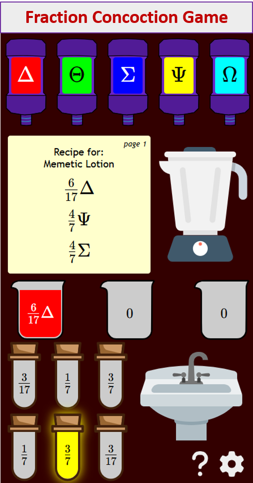
Fraction Concoction Game:
Master fractions in the lab: mix, add, and subtract beakers to create the perfect concoction!
Fact Family Game:
Complete fact families and master the link between addition & subtraction and multiplication & division.
Number Bond Garden:
Clear the board by matching number pairs that sum to ten in this garden-themed mental math puzzle.
Online Addition Subtraction Game:
Practice your addition and subtraction skills to help the penguin find its mummy.
We welcome your feedback, comments and questions about this site or page. Please submit your feedback or enquiries via our Feedback page.


