Illustrative Mathematics Grade 6, Unit 8, Lesson 15: Quartiles and Interquartile Range
Learning Targets:
- I can use IQR to describe the spread of data.
- I know what quartiles and interquartile range (IQR) measure and what they tell us about the data.
- When given a list of data values or a dot plot, I can find the quartiles and interquartile range (IQR) for data.
Related Pages
Illustrative Math
Grade 6
Lesson 15: Quartiles and Interquartile Range
Let’s look at other measures for describing distributions.
Illustrative Math Unit 6.8, Lesson 15 (printable worksheets)
Lesson 15 Summary
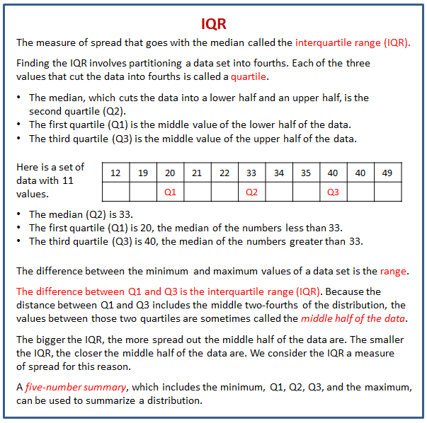
Earlier we learned that the mean is a measure of the center of a distribution and the MAD is a measure of the variability (or spread) that goes with the mean. There is also a measure of spread that goes with the median called the interquartile range (IQR).
The following diagram shows how to find the quartiles and interquartile range (IRQ) from a data set.

Lesson 15.1 Notice and Wonder: Two Parties
Here are two dot plots including the mean marked with a triangle. Each shows the ages of partygoers at a party.
What do you notice and wonder about the distributions in the two dot plots?
Lesson 15.2 The Five-Number Summary
Here are the ages of a group of the 20 partygoers you saw earlier, shown in order from least to greatest.
- a. Find and mark the median on the table, and label it “50th percentile.” The data is now partitioned into an upper half and a lower half.
b. Find and mark the middle value of the lower half of the data, excluding the median. If there is an even number of values, find and write down the average of the middle two. Label this value “25th percentile.”
c. Find and mark the middle value of the upper half of the data, excluding the median. If there is an even number of values, find and write down the average of the middle two. Label the value “75th percentile.”
d. You have now partitioned the data set into four pieces. Each of the three values that “cut” the data is called a quartile.
- The first (or lower) quartile is the 25th percentile mark. Write “Q1” next to “25th percentile.”
- The second quartile is the median. Write “Q2” next to that label.
- The third (or upper) quartile is the 75th percentile mark. Write “Q3” next to that label.
e. Label the least value in the set “minimum” and the greatest value “maximum.”
- Record the five values that you have just identified. They are the five-number summary of the data.
Minimum: _____ Q1: _____ Q2: _____ Q3: _____ Maximum: _____ - The median (or Q2) value of this data set is 20. This tells us that half of the partygoers are 20 or younger, and that the other half are 20 or older. What does each of the following values tell us about the ages of the partygoers?
a. Q3
b. Minimum
c. Maximum
Are you ready for more?
Here is the five-number summary of the age distribution at another party of 21 people.
Minimum: 5 years Q1: 6 years Q2: 27 years Q3: 32 years Maximum: 60 years
Do you think this party has more or fewer children than the other one in this activity? Explain your reasoning.
Are there more children or adults at this party? Explain your reasoning.
Lesson 15.3 Range and Interquartile Range
- Here is a dot plot you saw in an earlier task. It shows how long Elena’s bus rides to school took, in minutes, over 12 days.
Write the five-number summary for this data set by finding the minimum, Q1, Q2, Q3, and the maximum. Show your reasoning. - The range of a data set is one way to describe the spread of values in a data set. It is the difference between the greatest and least data values. What is the range of Elena’s data?
- Another number that is commonly used to describe the spread of values in a data set is the interquartile range (IQR), which is the difference between Q1, the lower quartile, and Q3, the upper quartile.
a. What is the interquartile range (IQR) of Elena’s data?
b. What fraction of the data values are between the lower and upper quartiles? Use your answer to complete the following statement:
The interquartile range (IQR) is the length that contains the middle ______ of the values in a data set. - Here are two dot plots that represent two data sets.
Without doing any calculations, predict:
a. Which data set has the smaller IQR? Explain your reasoning.
b. Which data set has the smaller range? Explain your reasoning. - Check your predictions by calculating the IQR and range for the data in each dot plot.
Glossary Terms
interquartile range (IQR)
The interquartile range is one way to measure how spread out a data set is. We sometimes call this the IQR. To find the interquartile range we subtract the first quartile from the third quartile.
For example, the IQR of this data set is 20 because 50 - 30 = 20.
quartile
Quartiles are the numbers that divide a data set into four sections that each have the same number of values.
For example, in this data set the first quartile is 20. The second quartile is the same thing as the median, which is 33. The third quartile is 40.
range
The range is the distance between the smallest and largest values in a data set. For example, for the data set 3, 5, 6, 8, 11, 12, the range is 9, because 12 - 3 = 9.
Lesson 15 Practice Problems
- Suppose that there are 20 numbers in a data set and that they are all different.
a. How many of the values in this data set are between the first quartile and the third quartile?
b. How many of the values in this data set are between the first quartile and the median? - In a word game, 1 letter is worth 1 point. This dot plot shows the scores for 20 common words.
a. What is the median score?
b. What is the first quartile (Q1)?
c. What is the third quartile (Q3)?
d. What is the interquartile range (IQR)? - Here are five dot plots that show the amounts of time that ten sixth-grade students in five countries took to get to school. Match each dot plot with the appropriate median and IQR.
- Mai and Priya each played 10 games of bowling and recorded the scores. Mai’s median score was 120, and her IQR was 5. Priya’s median score was 118, and her IQR was 15. Whose scores probably had less variability? Explain how you know.
- Draw and label an appropriate pair of axes and plot the points. A = (10,50), B = (30,25), C = (0,30), D = (20, 35)
- There are 20 pennies in a jar. If 16% of the coins in the jar are pennies, how many coins are there in the jar?
There are 20 pennies in a jar. If 16% of the coins in the jar are pennies, how many coins are there in the jar?
The Open Up Resources math curriculum is free to download from the Open Up Resources website and is also available from Illustrative Mathematics.
Check out our most popular games!
Fraction Concoction Game:
Master fractions in the lab: mix, add, and subtract beakers to create the perfect concoction!
Fact Family Game:
Complete fact families and master the link between addition & subtraction and multiplication & division.
Number Bond Garden:
Clear the board by matching number pairs that sum to ten in this garden-themed mental math puzzle.
Online Addition Subtraction Game:
Practice your addition and subtraction skills to help the penguin find its mummy.
We welcome your feedback, comments and questions about this site or page. Please submit your feedback or enquiries via our Feedback page.


