Describing a Distribution Displayed in a Histogram
Related Topics:
Lesson Plans and Worksheets for Grade 6
Lesson Plans and Worksheets for all Grades
More Lessons for Grade 6
Common Core For Grade 6
Videos and solutions to help grade 6 students learn how to construct a relative frequency histogram.
New York State Common Core Math Grade 6, Module 6, Lesson 5
Download lessons for 6th Grade
Lesson 5 Student Outcomes
- Students construct a relative frequency histogram.
- Students recognize that the shape of a histogram does not change when relative frequency is used compared to when frequency is used to construct the histogram.
Lesson 5 Summary
A relative frequency histogram uses the same data as a frequency histogram but compares the frequencies for each interval frequency to the total number of items.
The only difference between a frequency histogram and a relative frequency histogram is that the vertical axis uses relative frequency instead of frequency. The shapes of the histograms are the same as long as the intervals are the same.
Lesson 5 Classwork
Example 1: Relative Frequency Table
In Lesson 4, we investigated the head circumferences that the boys and girls basketball teams collected. Below is the frequency table of the head circumferences that they measured.
Isabel, one of the basketball players, indicated that most of the hats were small, medium, or large. To decide if Isabel was correct, the players added a relative frequency column to the table. Relative frequency is the value of the frequency in an interval divided by the total number of data values.
Exercises 1–4
- Complete the relative frequency column in the table below.
- What is the total of the relative frequency column?
- Which interval has the greatest relative frequency? What is the value?
- What percent of the head circumferences is between and ? Show how you determined the answer.
Example 2: Relative Frequency Histogram
The players decided to construct a histogram using the relative frequencies instead of the frequencies. They noticed that the relative frequencies in the table ranged from close to 0 to about 0.40. They drew a number line and marked off the intervals on that line. Then, they drew the vertical line and labeled it relative frequency. They added a scale to this line by starting at 0 and counting by 0.05 until they reached 0.40.
They completed the histogram by drawing the bars so the height of each bar matched the relative frequency for that interval. Here is the completed relative frequency histogram:
Exercises 5–6
5. Answer the following questions.
a. Describe the shape of the relative frequency histogram of head circumferences from Example 2.
b. How does the shape of this histogram compare with the frequency histogram you drew in Exercise 5 of Lesson 4?
c. Isabel said that most of the hats that needed to be ordered were small, medium, and large. Was she right?
What percent of the hats to be ordered is small, medium, or large?
6. Here is the frequency table of the seating capacity of arenas for the NBA basketball teams.
a. What is the total number of NBA arenas?
b. Complete the relative frequency column. Round to the nearest thousandth.
c. Construct a relative frequency histogram. Round to the nearest thousandth.
d. Describe the shape of the relative frequency histogram.
e. What percent of the arenas has a seating capacity between 18,5000 and 19,999 seats?
f. How does this relative frequency histogram compare to the frequency histogram that you drew in problem 2 of the Problem Set in Lesson 4?
Problem Set
- Below is a relative frequency histogram of the maximum drop (in feet) of a selected group of roller coasters.
a. Describe the shape of the relative frequency histogram.
b. What does the shape tell you about the maximum drop (in feet) of roller coasters?
c. Jerome said that more than half of the data values are in the interval from 50 to 130 feet. Do you agree with Jerome? Why or why not? - The frequency table below shows the length of selected movies shown in a local theater over the past 6 months.
a. Complete the relative frequency column. Round the relative frequencies to the nearest thousandth.
b. What percentage of the movie lengths are greater than or equal to 130 minutes?
c. Draw a relative frequency histogram. (Hint: Label the relative frequency scale starting at 0 and going up to 0.30, marking off intervals of 0.05.)
d. Describe the shape of the relative frequency histogram.
e. What does the shape tell you about the length of movie times? - The table below shows the highway miles per gallon of different compact cars.
a. What is the total number of compact cars?
b. Complete the relative frequency column. Round the relative frequencies to the nearest thousandth.
c. What percent of the cars get between 31 and up to but not including 37 miles per gallon on the highway?
d. Juan drew the relative frequency histogram of the highway miles per gallon for the compact cars, shown on the right. Did Juan draw the histogram correctly? Explain your answer.
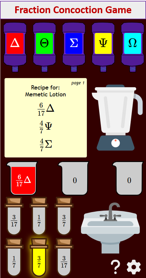
Try out our new and fun Fraction Concoction Game.
Add and subtract fractions to make exciting fraction concoctions following a recipe. There are four levels of difficulty: Easy, medium, hard and insane. Practice the basics of fraction addition and subtraction or challenge yourself with the insane level.

We welcome your feedback, comments and questions about this site or page. Please submit your feedback or enquiries via our Feedback page.