Box Plot
Related Pages
Graphical Methods For Describing Data
Bar Charts
Cumulative Frequency Table
Statistics Lessons
In these lessons, we will learn how to construct and read a box plot (also known as box-and-whisker plot).
A box plot (also called a box and whisker plot) shows data using the middle value of the data and the quartiles, or 25% divisions of the data. It is a standardized way of displaying the distribution of a dataset based on its five-number summary. It provides a quick visual summary of the data’s spread, central tendency, and potential outliers, making it particularly useful for comparing distributions across different groups.
The following diagram shows a box plot or box and whisker plot. Scroll down the page for more examples and solutions using box plots.

Statistics Worksheets
Practice your skills with the following worksheets:
Printable & Online Statistics Worksheets
The Five-Number Summary
The foundation of a box plot is these five key values from a dataset:
1. Minimum Value: The smallest observation in the dataset (excluding outliers).
2. First Quartile (Q1) / Lower Quartile: The value below which 25% of the data falls. It’s essentially the median of the lower half of the data.
3. Median (Q2) / Second Quartile: The middle value of the entire dataset when ordered from least to greatest. 50% of the data falls below this value.
4. Third Quartile (Q3) / Upper Quartile: The value below which 75% of the data falls (or above which 25% of the data falls). It’s the median of the upper half of the data.
5. Maximum Value: The largest observation in the dataset (excluding outliers).
Drawing A Box And Whisker Plot
Example:
Construct a box plot for the following data:
12, 5, 22, 30, 7, 36, 14, 42, 15, 53, 25
Solution:
Step 1: Arrange the data in ascending order.
Step 2: Find the median, lower quartile and upper quartile.

Median (middle value) = 22
Lower quartile (middle value of the lower half) = 12
Upper quartile (middle value of the upper half) = 36
(If there is an even number of data items, then we need to get the average of the middle numbers.)
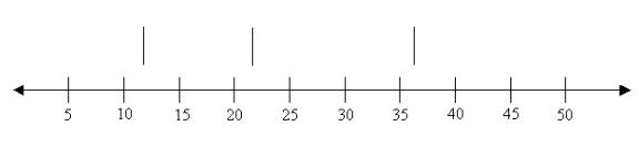
Step 3: Draw a number line that will include the smallest and the
largest data.

Step 4: Draw three vertical lines at the lower quartile (12),
median (22) and the upper quartile (36), just above the number line.
Step 5: Join the lines for the lower quartile and the upper
quartile to form a box.
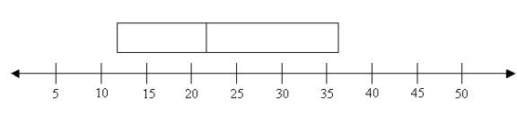
Step 6: Draw a line from the smallest value (5) to the left side
of the box and draw a line from the right side of the box to the biggest value (53).

How To Draw A Box And Whiskers Plot For A Set Of Data?
Example:
Make a box-and-whisker plot for the following data set.
7, 3, 14, 9, 7, 8, 12.
How to interpret a box and whisker plot?
Box and Whisker Plots are graphs that show the distribution of data along a number line. We can
construct box plots by ordering a data set to find the median of the set of data, median of the
upper and lower quartiles, and upper and lower extremes. We can draw a Box and Whisker plot and
use box plots to solve a real world problem. By finding the middle values of the ordered data
set, you have separated the data into four equal groups called quartiles. A shorter distance
means the quartile data is bunched together. A longer distance means the quartile data is spread out.
For example, if your job is to compare the annual snowfall between two ski resorts for the past 50 years, you would need a way to summarize all the data. A box plot displays the range and distribution of data along a number line.
How To Make A Box Plot From A Set Of Data?
- Order the data from least to greatest.
- Find the median or middle value that splits the set of data into two equal groups. If there is no one middle value, use the average of the two middle values as the median.
- Find the median for the lower half of the data set.
- Find the median for the upper half of the data set.
- Use these five values to construct a box plot: lower extreme, lower quartile, median, upper quartile, upper extreme.
- Plot the points of the five values above a number line.
- Draw vertical lines through the lower quartile, median and upper quartile.
- Form a box by connecting the vertical lines from the lower quartile, median, and upper quartile.
- Draw the whiskers from the extremes to the box.
Outliers In A Box And Whiskers Plot
What is an outlier?
An outlying observation, or outlier, is one that appears to deviate markedly from other members of
the sample in which it occurs.
- Inter-Quartile Range (IQR) is the distance between the first and second quartiles.
- Multiply the IQR by 1.5.
- Subtract that value from the 1st Quartile to get your lower boundary.
- Add that value to the 2nd Quartile to get your upper boundary.
- Values in the data set that fall outside of these limits are considered outliers.
Understanding & Comparing Boxplots (Box And Whisker Plots)
Box and whisker plots are graphical displays of the five number summary (minimum, quartile 1,
median, quartile 3, and maximum).
Compare two boxplots and see how larger spread makes predictions more difficult.
Check for evidence of claim using the boxplots.
What a Box Plot Tells You:
Central Tendency: The median line shows the center of the data.
Spread/Dispersion: The length of the box (IQR) shows the spread of the middle 50% of the data. The overall length of the whiskers and box indicates the total spread (range).
Skewness:
If the median line is not in the center of the box, or if one whisker is significantly longer than the other, it indicates skewness in the data distribution.
If the right side of the box and the upper whisker are longer, the data is right-skewed (positively skewed).
If the left side of the box and the lower whisker are longer, the data is left-skewed (negatively skewed).
Outliers: Easily identifies data points that are significantly different from the rest.
Check out our most popular games!
Fraction Concoction Game:
Master fractions in the lab: mix, add, and subtract beakers to create the perfect concoction!

Fact Family Game:
Complete fact families and master the link between addition & subtraction and multiplication & division.

Number Bond Garden:
Clear the board by matching number pairs that sum to ten in this garden-themed mental math puzzle.

Online Addition Subtraction Game:
Practice your addition and subtraction skills to help the penguin find its mummy.

We welcome your feedback, comments and questions about this site or page. Please submit your feedback or enquiries via our Feedback page.